OVERVIEW
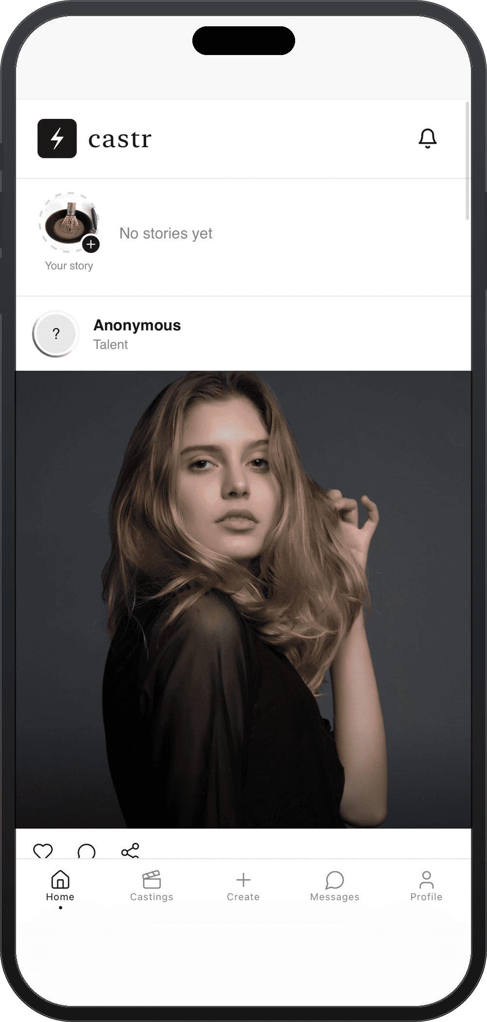
Castr is a fashion casting marketplace, think LinkedIn, but built specifically for the fashion industry. Connecting talent with the recruiters making casting easier for each other.
The client came in with an idea but no real product. I was given a rough skeleton with no structure, functionality, or identity.
UI/UX AUDIT
Before any redesign work began, I ran a full usability pass on the existing app, resulting in 35+ issues found across branding, navigation, and interaction design. From broken interactions to structural gaps in how the product was organized, it needed a full revamp.
This audit guided the full redesign that followed.

MAIN DESIGN DECISIONS
ROLE BASED NAVIGATION + DUAL ACCOUNT ACCESS
Previously, Talent and Recruiters used the same interface. Several functions didn't apply to both roles, which cluttered the experience.
I designed two distinct interfaces instead. At sign-up, users choose whether they're Talent or Client, and each gets a navigation structure built around what that role actually needs. Both follow the same five-tab shape, Home, Casting, Create, Messages, Profile, but what each tab actually shows and does differs by role
Since some users are legitimately both, I also added the ability to hold both account types under one login and switch between them from Settings, rather than forcing a single identity or requiring two separate accounts with two separate log ins.


CASTING SECTION - Per Role
The original casting section let both roles swipe through and apply but that was as far as it went. Talent couldn't tell which castings they'd already applied to or check their status, and clients had no visibility into who'd applied to their own postings. I built status tracking specific to each role instead.
TALENT
The casting section is separated into three sub-categories: Calls, Applied and Saved.
Calls
Talents browse casting calls they're eligible for, based on their profile in a swipe-based format the client requested, and can apply directly
Applied
Displays every casting they've already submitted to, giving a clear view of pending applications.
Saved
Displays the castings bookmarked for later, kept separate from active applications.
RECRUITER
The casting section for recruiters is separated into four sub-categories: Active, Drafts, Apps, Past.
Active
Displays any live castings currently open for applications posted by the recruiter.
Drafts
Saves castings you've started but haven't published yet.
Apps
Displays castings once applications start coming in, shown alongside the applicants
Past
The archive of closed castings, with their application history retained. Useful for revisiting candidates from previous calls.
THREE STEP CASTING WIZARD - Recruiter
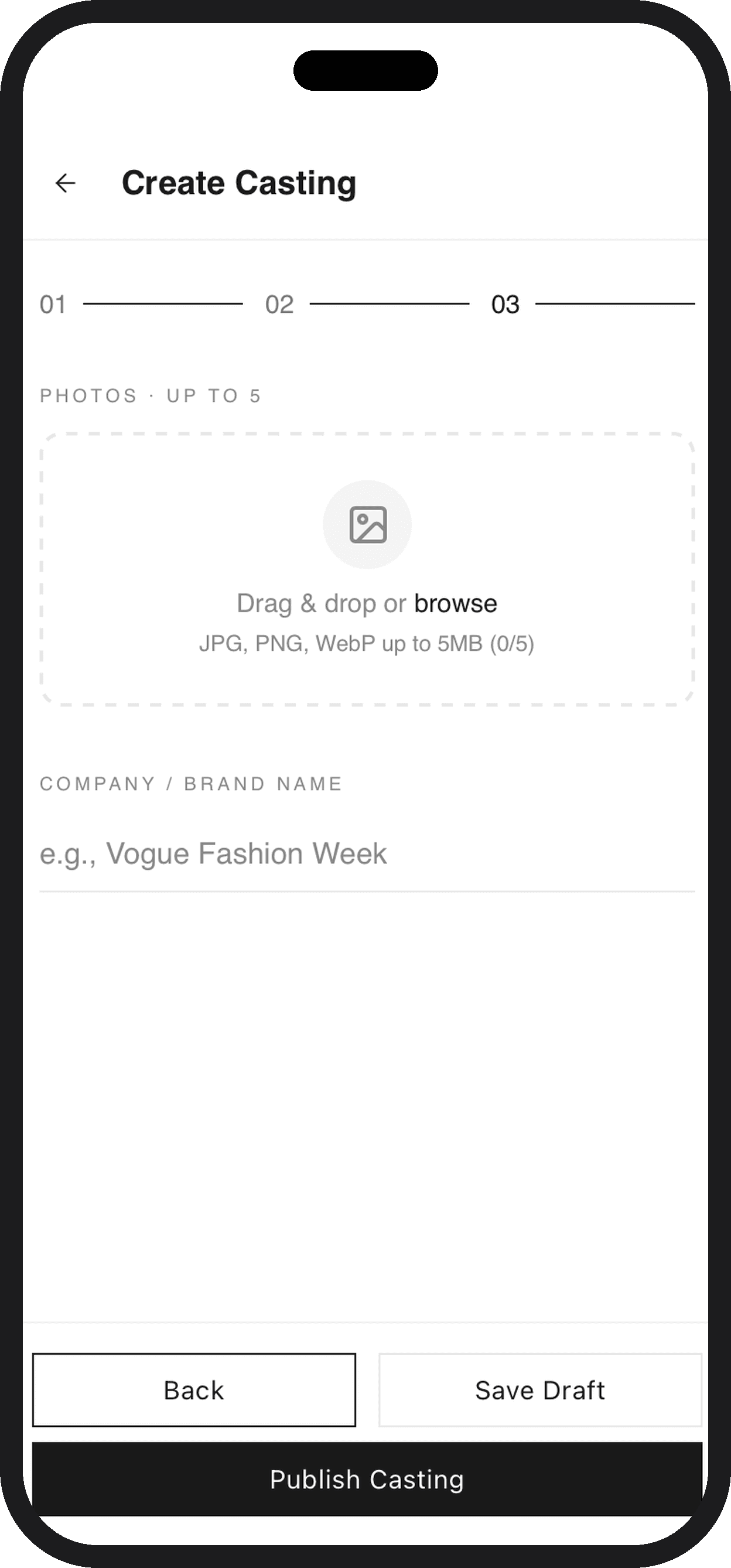
Creating a casting used to be one long scrollable form with every field (title, talent type, location, pay, schedule, photos) stacked on a single screen. It was long enough that it made you want to quit halfway through, with no sense of how much was left or whether you'd already done the hard part. I redesigned it into a 3-step flow instead:
Brief : casting title, casting type, talent type (multi-select tags like Models, Photographers, Stylists), and a description of the opportunity.
Job Details : location, pay and pay type, number of open spots, event date, and application deadline.
Media & Publish : up to 5 photos, company/brand name, and the final choice to save as a draft or publish live.
Each step shows clear progress (01 / 02 / 03) so recruiters always know where they are and what's left. If someone exits mid-flow, their progress auto-saves to Drafts — so nothing gets lost, and they can pick up exactly where they left off instead of starting over.


PORTFOLIO vs POSTS - Talent
The client wanted a social element built into the app, letting talent post pictures the way they would on any other platform. But I felt recruiters needed something more curated to actually evaluate someone — a scrolling feed of casual posts doesn't show off a talent's best work the way a portfolio does. So I split the profile into two distinct sections instead of forcing everything into one feed.
Portfolio shows one image at a time, swipeable, so recruiters can move through a talent's strongest, most deliberately chosen shots without distraction.
Posts sits alongside it and you can swipe over to see a grid of everything else they've shared, in the familiar social-media format, which can be tapped to enlarge and view individually, just like Instagram or similar platforms.
THE UNNOTICED DETAILS
A list of small tweaks that seem minor individually, but quietly improve the overall experience :
Notification banners now auto-dismiss after 1.25s and are swipeable
Removed the redundant "welcome back" notification
Fixed the casting-detail back button, which was incorrectly jumping to Home
Fixed the Saved button, which wasn't actually persisting saves
Restricted saving posts to signed-in users only
"Suggested for You" now filters out your own account and existing connections
Castr logo now reliably navigates home from Auth, Complete Profile, and Header screens
REFLECTION
What originally began as a UI/UX audit led me to redesign the full app, from visual identity to role-based access for Talent and Client accounts, to flows like the casting wizard, built from scratch. Along the way, I learned how much of design work lives in the details: small bugs that seem minor on the surface often point to bigger gaps, and fixing them is where the real difference gets made. Castr went from a rough skeleton with no clear identity to a product that finally felt like itself.